iOS, Android, Web

Safeway

Redesigned Albertsons-Safeway's mobile shopping app to be fully native, then set the strategy to unify it with the company's loyalty app and its 2 million active users.

RoleUX Design Lead
Team1 PM, business owner, UI design lead
The Problem

Albertsons-Safeway (ABSCO) ran two disconnected mobile products: a shopping app and a loyalty app called Just 4 U, which had four times the active users of the shopping app it was meant to complement. The client's mandate was to rebuild the shopping app into something fully native, then combine both user bases into a single experience without losing either one.

Coupon clipping was a chore users skipped. Only 38% of users clipped a coupon in the app, but the ones who did carried baskets $8 to $10 bigger than the ones who didn't. That gap was real revenue sitting behind a confusing interaction.

Browsing was buried. Reaching an actual, buyable product card took four levels of menu drill-down, deep enough that the app's own structure worked against its conversion goal.

Checkout was a webview pretending to be native. It was an iframe of the mobile web checkout dropped into an otherwise native experience, the one moment in the flow where the illusion visibly broke.

4xmore active users on the loyalty app than on the shopping app it was meant to complement
38%of users clipped a coupon — but those who did carried $8–10 bigger baskets
4screens deep to reach a single buyable product card
8/10of the app's top pain points traced back to checkout
The numbers anchoring the redesign — the app split, coupon clipping, category browse, and checkout.
My Role

I was UX design lead on the rebuild, responsible for wireframes and flows across the full redesign and for the strategy behind both the native rebuild and the later app unification. I worked directly with a product manager, business owner, and UI design lead, and inherited existing research from the client rather than starting discovery from zero.

Key Decisions
1

Consolidating Deals Instead of Multiplying Card Types

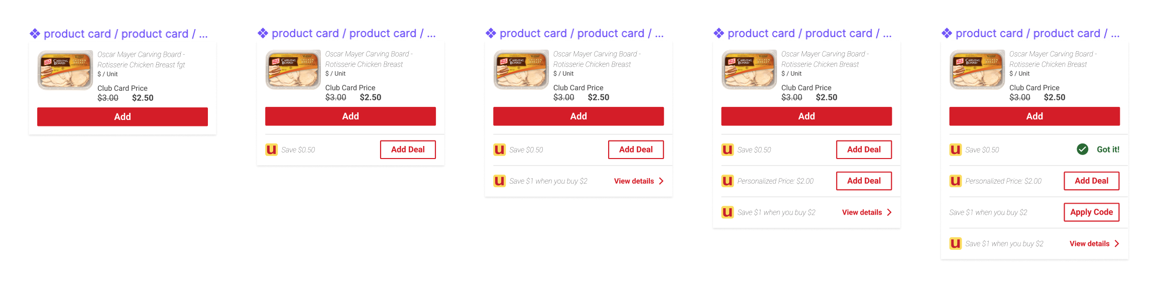
Safeway had four separate types of savings, J4U deals, buy-one-get-one offers, promo codes, and club card deals, spread across a confusing set of screens, and a single product could carry more than one at once. The easy fix is a card variant for each deal type. I didn't build that, because a product with two or three deal types stacked would still need its own bespoke card, and that number of variants grows every time the business adds a new promotion type. Instead I designed one standard product card with a deal section underneath it that scales independently, from zero deals to several, and pulled every deal type into a single tab so users stopped guessing where a given discount lived. The card system had to hold up under combinations the business hadn't invented yet, not just the ones that existed at launch.

2

Cutting Category Browse From Four Screens to One

Finding a product meant drilling from a top category into a subcategory into a sub-subcategory before a single buyable product card appeared: Baby Care to Baby Accessories to Bottles and Nursing, three taps before anything a user could add to a cart. I collapsed that into a single accordion screen: open the top category, and the subcategory expands in place alongside featured products, the full product set, and any further breakdowns still available underneath it. Users reached real products in one screen instead of three, and Safeway got a slot to feature a curated product carousel it didn't have before. I paired this with predictive search and a recently-searched list on the home tab's search entry point, so browse and search were solving the same problem from two directions.

3

Choosing the Checkout Model Least Likely to Fail Quietly

Eight of the app's top ten pain points traced back to checkout, and the single biggest exit point in the flow was the date and time selection step. I built three checkout concepts against the same three objectives: reduce friction and keep users oriented, surface the right information at the right moment with real-time validation, and keep things transparent and controllable once checkout was done. We moved forward with the table-view option. It reduced friction the most and was the easiest of the three to scale as new order types and edge cases got added later, but it gave up some of the moment-to-moment visibility the other concepts had built in. I mitigated that by investing more heavily in the post-checkout Your Orders experience, using iconography and notifications to keep users oriented after checkout instead of during it. The alternative concepts protected against that risk earlier in the flow at the cost of more friction throughout. I bet a strong post-checkout safety net was worth trading for a faster path through it.
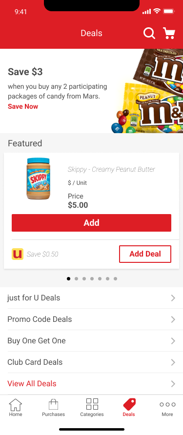
Deals tab consolidating J4U, buy-one-get-one, promo code, and club card savings
Symbols from the Sketch file for standardized product cards, with a deal section that scales beneath each one.
Standard product card scaling from zero deals to several stacked deals
One card system holds from zero to several stacked deals without a new variant for each combination.
Category browse collapsed from a four-screen drill-down into a single accordion screen.
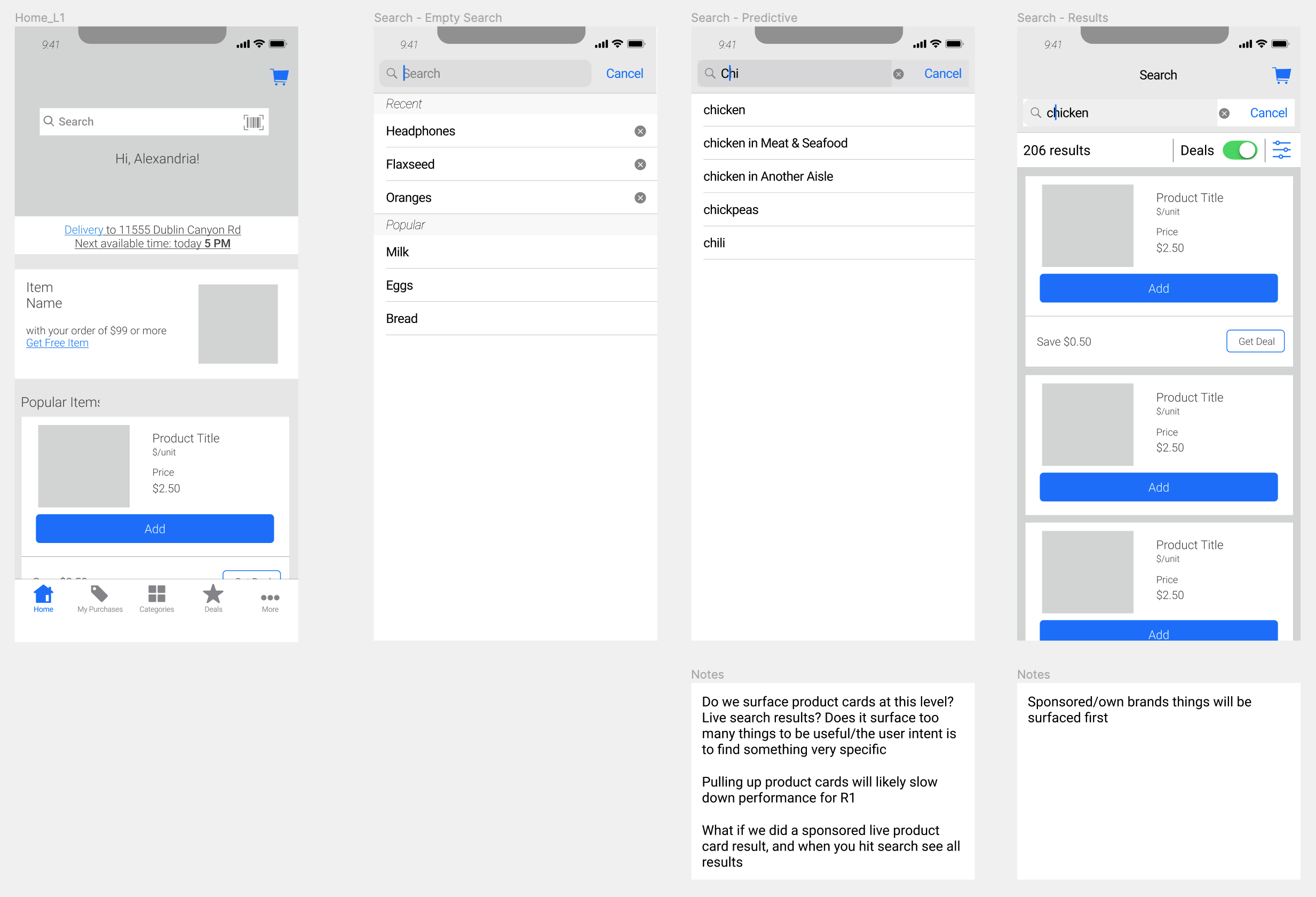
Search wireframes: home entry point, empty state, predictive search, and results with a deals filter
Predictive search and a recently-searched list on the home tab solved browse and search from two directions.
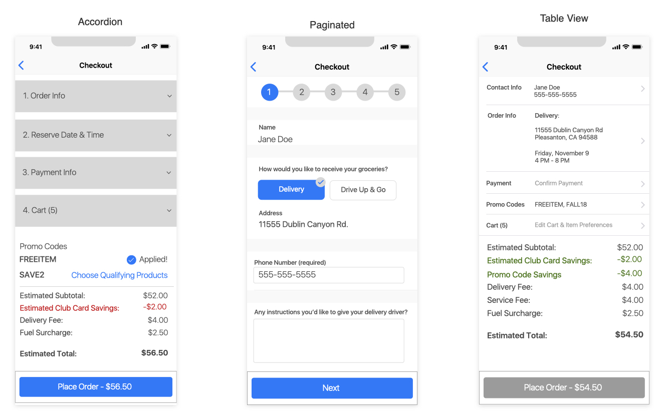
Three checkout concepts: accordion, paginated, and table view
Three concepts tested against the same objectives — accordion, paginated, and the table view that shipped.
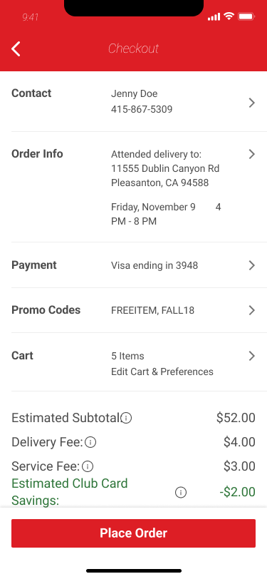
Checkout summary with every step completed and Place Order enabled
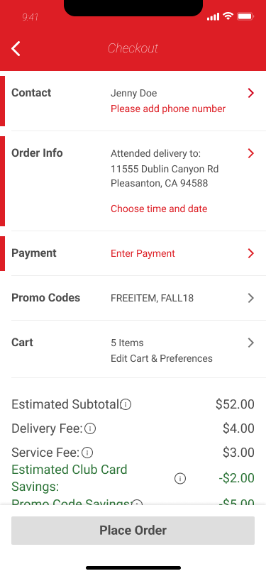
Checkout summary with missing contact, delivery time, and payment info flagged in red
IncompleteReady to Order
Real-time validation flags missing info in red until every step is complete.
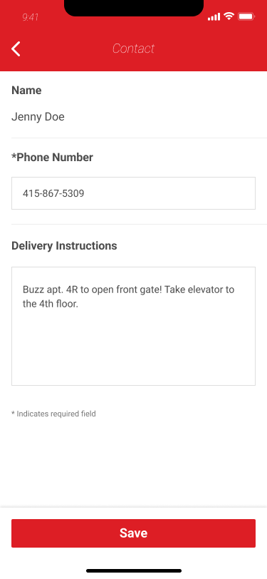
Checkout contact step
Contact info
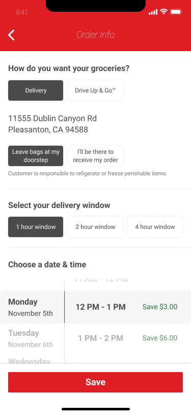
Delivery date and time selection with a sticky save action
Delivery window selection, the flow's biggest exit point
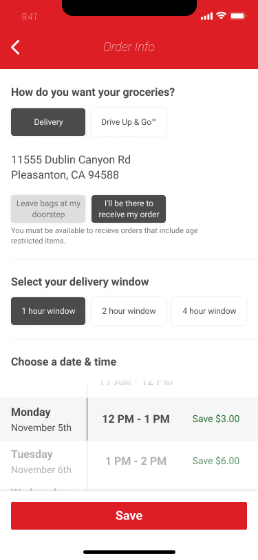
Order info flagging an age-restricted item
Age-restricted items flagged in delivery info
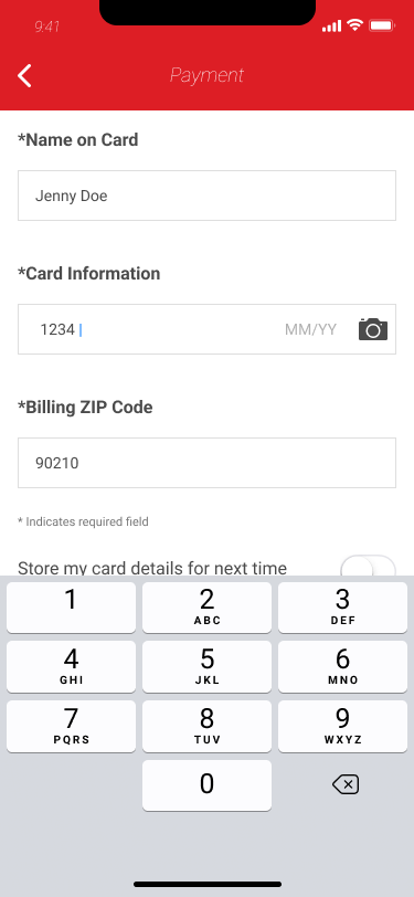
Payment entry with a focused, validated field
Payment entry with real-time field validation
Cart details editable from the checkout summary
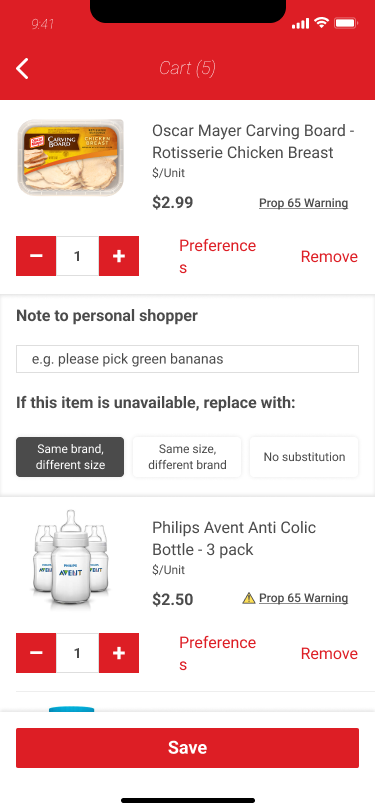
Cart and item preferences, editable inline from the summary
Outcome
20%Drop in call-center inquiries about order status after the home tab redesign

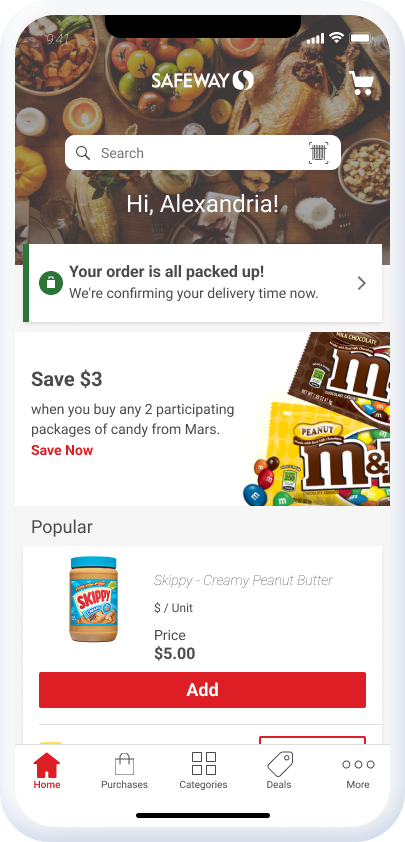
The one number I have a hard measurement for: after the home tab change put order and delivery status front and center, calls to the call center about order status dropped 20%.

I left the project for a new role before the deals consolidation, category redesign, and checkout change could run against real usage, so I don't have basket size, conversion, or abandonment numbers to point to for those three. What I do have is that each decision was built with a specific number already attached to it: clip rate and the $8 to $10 basket lift behind it, time-to-product against the old four-screen drill-down, and abandonment concentrated at the checkout date and time step. Whoever picked this up next inherited a design with its own success criteria already built in, not a set of finished screens with no way to tell if they'd worked.

Home tab for a current order, showing packed-up status and delivery confirmation
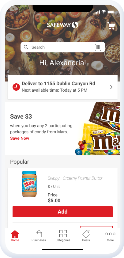
Home tab for a new order, showing delivery address and next available time
New OrderOrder In Progress
The home tab surfaces delivery and order status directly, for both new and current orders.