Albertsons-Safeway companies (ABSCO) has separate mobile apps for their shopping and loyalty experiences. The loyalty app has 2MM active users, which is more than quadruple the shopping app. Our challenge was to redesign the shopping app to make it fully native, seamless, and beautiful, before unifying it with the loyalty app and combining the user bases. The client came to us with three major pain points to solve.
Simplify the coupon clipping process. Only 38% of users clipped coupons in the mobile app, though those who did had an average basket size of $8-$10 more than users who did not.
Improve the browsing experience to allow users to view products faster. Previously, users had to drill down 4 levels until they reached buyable product cards. With the new UX, users can view products while continuing to narrow down results either by category or filtering.
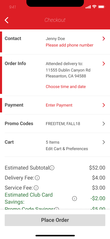
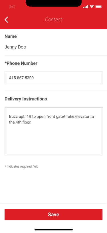
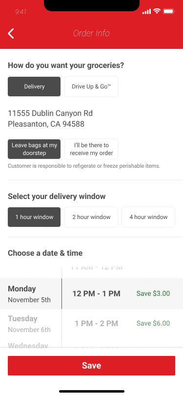
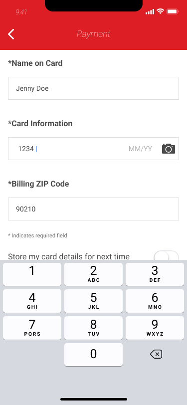
Create a native checkout experience that drives conversion. The current checkout process on the mobile app is an iframe of the mobile web experience, a jarring departure from the native experience that the user has until tapping the checkout button. Our goal in redesigning checkout was not simply to make it native, but to rethink the patterns used to eventually get us to the ideal experience - one tap checkout.
My Role
As the UX design lead on this project, my role was to provide a strategy for both updating the current shopping app to be a fully native and seamless experience, as well as how to later combine it with the loyalty app. I worked closely with our product manager, business owner, and UI design lead to inform my strategy and designs each step of the way. I was also responsible for delivering all wireframes and flows, and working with the visual designer to bring the experience to life.
Primary and Secondary Research
When I joined this project, I was lucky to inherit rich research documentation that identified pain points and business needs by the client. Our project brief was clear in its goals - to update and improve the shopping app experience, and combine it with the loyalty app without losing any customers.
From the research, I learned that customers who are active in the Just 4 U (J4U) deals program and engage with Safeway’s mobile apps spend more than 2x the customers who are not active app users. I also learned that the current issues around registration and checkout were barriers to entry and conversion, and that the app experience did not follow the customer journey of planning, shopping, and consuming, which made it feel fragmented.
The shopping app as it existed was not omni channel focused, with confusion around the difference between order history vs purchase history, product navigation that was focused on aisles, and a badly designed checkout experience. Two out of the top three pain points for the ecommerce app were about order status and late delivery. The J4U app had confusing navigation, was also store focused, and the process of clipping coupons and receiving their rewards was confusing to users.
Design
We approached the design of this app by breaking it down into 3 phases.
Deliver quick wins and improve the coupon & deals experience
Find products more easily (search, browse, filter)
Improved checkout to decrease abandoned carts
Phase 1
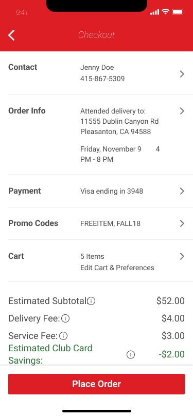
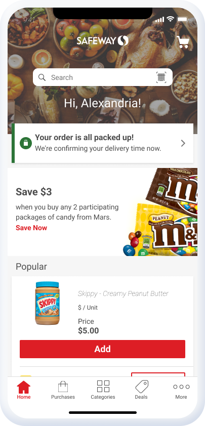
Phase 1 was about delivering quick wins while the backend team got the APIs into place. Without changing the architecture, we improved the home tab experience to put delivery information front and center so users could instantly understand the status of their order. Understanding that after searching for products to begin building an order, users most frequently want to know the status of their latest order and delivery information, the home tab has a dedicated space for either helping the user begin a new order for pickup or delivery, or to provide information about their latest order. After this update was rolled out, calls to the call center regarding order status dropped by 20%.
For new orders, users see relevant delivery address and time information
For current orders, users see information about the status of the order
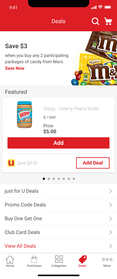
The next focus for phase 1 was around coupons and deals for app users. According to the research, users found clipping deals to be a chore, confusing, and they were unsure how the J4U deals worked with other deals offered by Safeway such as promo codes, buy one-get one deals, etc. The existing J4U app was store focused instead of omnichannel, making it less useful for users who shopped both online and in-store, and the app’s navigation was confusing.
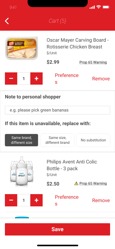
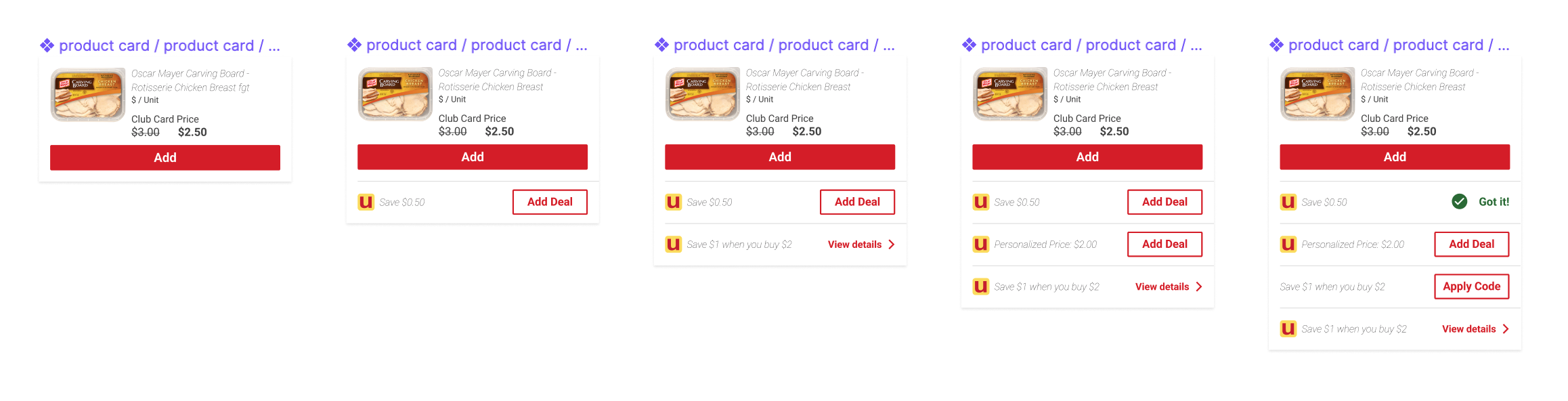
In the redesign, I pulled all of the deals into a tab that collected J4U deals, buy one-get one deals, promo codes, and club card deals into one place. For users that shop exclusively by deal, this allows them easy access to everything at once. In addition to the navigation change, I also redesigned the product cards so that each card is standard, with the addition of scalable deal sections beneath it. Some products have multiple types of deals available for them, and I needed a way to show them without needing to design multiple different sized cards. Now, each card has deals beneath it, with a clear call to action to clip them to get the deal.
Symbols from my Sketch file of standardized product cards, with deals that scale beneath it. Products can have multiple deals of the same type, as well as multiple types of deals associated with them simultaneously.
Phase 2
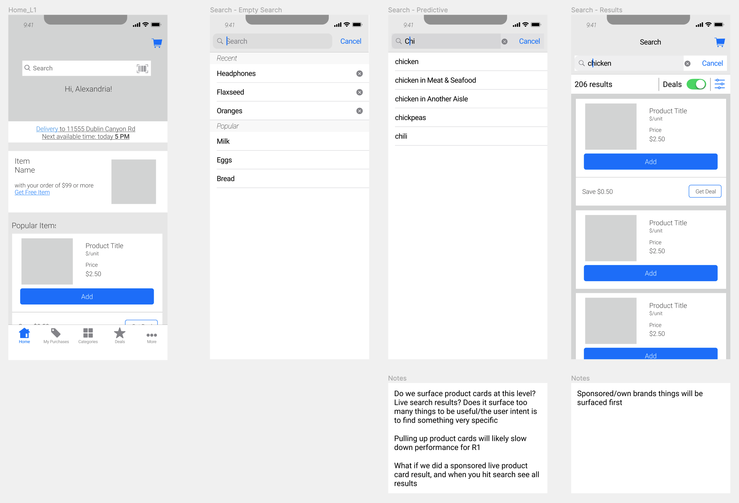
Phase 2 was about finding products. This meant updates to search, browse, and filter, to allow users to more quickly find what products they’re looking for when building a basket. The very first thing a user sees on the home tab is the search bar, which when the user selects it, immediately brings up their recently searched products and trending searches. Additionally, the engineering team was able to build in predictive search to help users complete their queries and get them to the results they’re looking for faster.
Wireframes showing the search functionality as well as notes and questions in my working file.
From the results page, I included a toggle filter for deals, further encouraging the coupon clipping behavior that results in bigger overall baskets. Additional filters such as department, brand, and nutrition (organic, gluten free, etc.) are available under the filter button, should users have more specific criteria they want to filter by.
The other major update for finding products was the categories browse organization. Previously, users had to drill down 3 levels in the menu before they were shown any relevant product cards (for example, Baby Care > Baby Accessories > Bottles & Nursing > view products). By reorganizing the experience for the user to open the main category and subcategory in one screen as an accordion (Baby Care > Baby Accessories) and then showcasing featured products, all products in that category, as well as additional category breakdowns available (Bottles & Nursing), I was able to get users to relevant products faster, plus provide a way for Safeway to feature a carousel of products they want to highlight. As always, the deals tab and filters are available to help continue to encourage their use.
Phase 3
Phase 3 was redesigning the checkout experience. According to our research, 8 out of the top 10 pain points were related to the checkout process, and the greatest number of page exits happened on the checkout date and time. Given this information, I redesigned the checkout flow with 3 different options - all of them keeping 3 main objectives in mind.
Reduce Friction, Simplify Interactions - Make sure users know exactly where they are in the process, whether through iconography or copy
Right Information, Right Time - Make sure the right information is available at a glance, with real time validation if possible
Transparency and Control - After the checkout process, show users relevant information after they’ve completed checkout, and provide users with options if their order is impacted
Ultimately, we decided to move forward with the table view option which had the benefits of reducing friction and was scaleable, with only a potential risk of making sure the right information was available to users when they needed it, and no major risks. We mitigated the risk by creating a more thorough experience around Your Orders, with thoughtful iconography and notifications.
Results
Although I left the project to pursue a new job opportunity, the next steps I would have taken would be to thoroughly test our assumptions with the new designs. Were users able to find and apply deals more easily? Did the average basket size increase as a result? Did the number of exits decrease after the checkout redesign? Based on user feedback, I would have continued to iterate on the designs until our goal KPIs were achieved.


%20(FINAL).001.jpeg)